When leveraged traders pile in, the exchange sets a price where each position gets force-closed. The GH Liquidity Map estimates where those liquidations stack up and paints them as heat bands right on your chart. You see the zones forced orders tend to pull price toward. It is a map, not a signal.

A liquidation heatmap is a chart overlay that shows where leveraged positions are likely to get wiped out. Open a 10x long and the exchange sets a price where your position gets force-closed. Thousands of traders do the same thing at the same levels, so those liquidation prices stack up. A heatmap estimates where they cluster and shades each area as a heat band. Brighter and thicker means more leverage is likely parked there. When price reaches a heavy band, the forced orders can act like a magnet and pull price in. The map shows you where that fuel sits. What you do with it is your own research.

Six things the map puts on your chart. Each one is descriptive. None of it tells you to buy or sell.
Each shaded band marks a price area where leveraged positions are likely to liquidate. Brighter and thicker means more estimated leverage sits there.
The heaviest bands act like magnets. Forced liquidation orders there can pull price toward the level, so the chart often gravitates to them.
Bands above price come from shorts that get squeezed if price rises. Bands below come from longs that get stopped out if price falls.
Heat decays over time, so fresh positioning burns hottest. Once price trades into a band, the map marks it consumed and fades it to history.
Get an alert before price reaches a heavy band, so you do not have to watch the chart all day to spot a level filling up.
It runs as an indicator on your own TradingView charts. No new app, no exchange login, no extra account.
Most liquidation overlays draw a flat line at the naive one over leverage distance and call it a day. That number is wrong, because a position liquidates at its maintenance margin, not at the full notional. The GH Liquidity Map fixes that and adds the parts that actually decide whether a band matters. Here is the real method, step by step.
A liquidation happens when losses eat the maintenance margin, not the whole position. So the real liquidation price sits closer to entry than the naive one over leverage math suggests. The map computes each tier off the maintenance-margin distance, which puts the band where the exchange would actually force the close. Small difference on paper, large difference on a fast move.
Leverage does not enter randomly. It piles in at confirmed swing highs and lows, the obvious levels where breakout and bounce traders pull the trigger. The map anchors its entry clusters there, then applies a crowd filter: it keeps a cluster only when position flow ran above a 300-bar baseline. A quiet swing gets ignored. A crowded one becomes a band.
From each crowded cluster the map projects liquidation tiers for 5x, 10x, 25x, 50x and 100x. The higher the leverage, the closer the tier sits to entry, so the 100x bands stack near the cluster and the 5x bands sit far out. Shorts trapped at highs throw their bands above price. Longs trapped at lows throw their bands below price. That is why a strong rally lights up the zone overhead and a flush lights up the zone beneath.
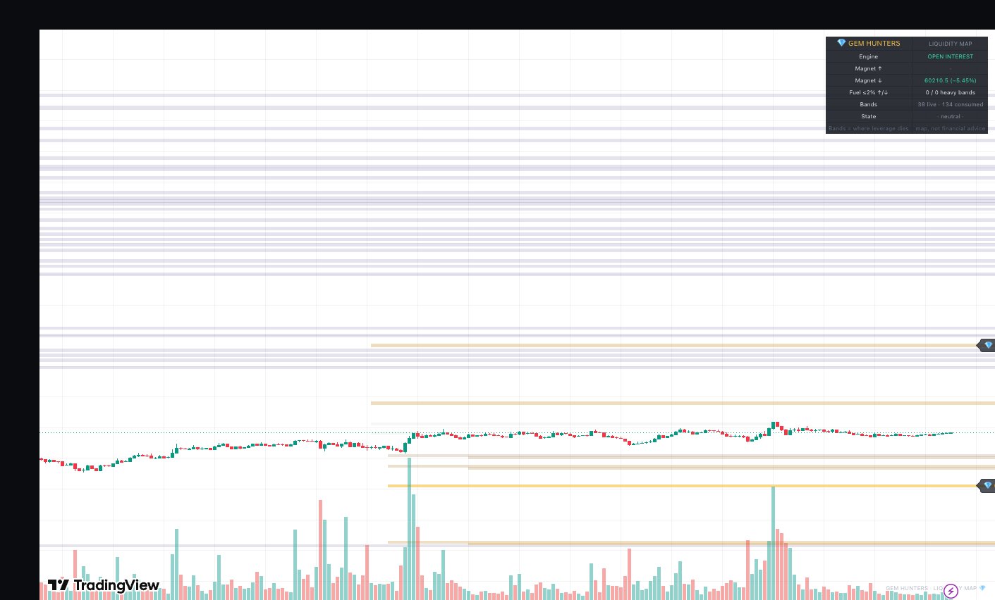
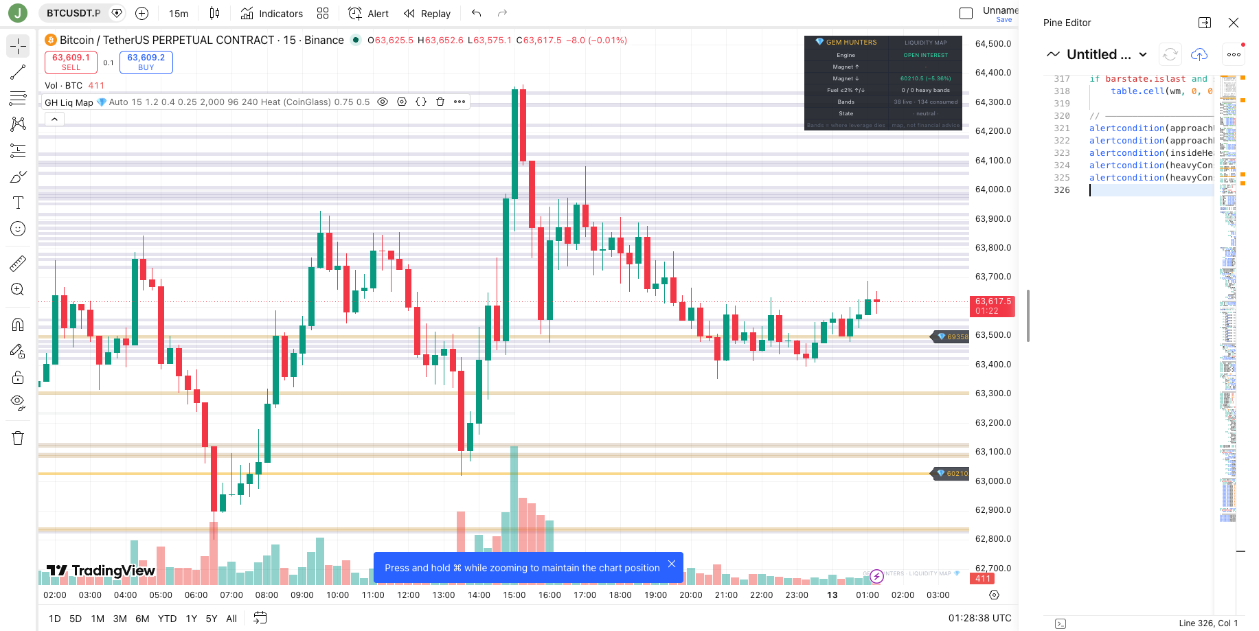
A band is only as heavy as the money behind it. The map weights each cluster by Open Interest, the size of leveraged positioning actually outstanding. When an Open-Interest feed is not available for a market, it falls back to Volume automatically, so you still get a weighted map instead of a flat one.
Bands are drawn on an ATR-scaled grid, so the band width tracks how volatile the market is instead of using a fixed pixel size. Heat then decays on a half-life. Fresh positioning burns hottest and old positioning cools off, which keeps the chart honest about what is current. When price trades into a band, the band is consumed and stays on the chart as faded history, so you can see which fuel already burned.
Proximity alerts fire before price reaches a heavy band, so a level filling up does not slip past you. The defaults were calibrated on 29 months of data, from January 2024 to May 2026, on Binance USDT-perp futures for BTC, ETH and SOL, on the 15m and 1h timeframes. Those are the markets and presets the numbers below come from.
We measured how often price came back and tagged a band in the 29-month test window. Read this as distance, not edge. It tells you how reachable a band tends to be, so you can size targets and stops with context. It is not a win rate and it is not a prediction.
| Preset | Tier | Within a day | Within a week |
|---|---|---|---|
| 15m | 100x bands | 37 to 44% | 70 to 75% |
| 1h | 100x bands | 25 to 30% | n/a |
On the 15m preset, the closest 100x bands got tagged 37 to 44% of the time within a day and 70 to 75% within a week. On the slower 1h preset, those bands got tagged 25 to 30% of the time within a day. Closer, denser bands are more reachable, which is the whole point of seeing them. How often price reached a band is distance, not magic. None of these numbers say which way price goes or whether a trade works.
The map earns its keep as context, not as a trigger. A heavy band overhead is a place a rally can run to as shorts get squeezed, so some traders treat the nearest heavy band as a logical area to take profit rather than guessing a round number. A heavy band below price is a place a flush can reach as longs get stopped, which is useful when you set a stop, because parking it just inside a magnet is asking for it to get tagged. Empty space between price and the next band means there is little forced fuel nearby, so moves can be slower. The map does not tell you to enter. It tells you where the leverage is, and you decide what that means for your own plan.

No indicator can see exchange liquidation engines. This is an estimate built from public chart data. Treat the map as context for risk and targets, not as buy or sell signals. It does not predict price, and it makes no claim about accuracy, edge, or returns. Crypto is volatile and you can lose money, and leverage multiplies losses as well as gains. A clearer view of where leverage sits is still just a view, and the trade is still your call. Size every position so a loss never hurts. Nothing here is financial advice.
The GH Liquidity Map is free for the Gem Hunters community. It is an invite-only indicator on TradingView, so we add your TradingView username to the access list by hand. Join the free Gem Hunters group first, share your TradingView username inside, and you get the map added to your charts. No payment, no upsell, no catch. Just the tool, plus 40,000+ hunters comparing notes.
Join free and get the mapA liquidation heatmap is a chart overlay that shows where leveraged traders are likely to get liquidated. When you open a leveraged long or short, the exchange sets a price where your position gets force-closed. A heatmap estimates where a lot of those liquidation prices stack up, then shades those areas as heat bands. Brighter means more leverage is likely parked there. It describes where forced selling or buying could cluster, it does not predict what price will do.
Each colored band marks a price area where leveraged positions are likely to liquidate. The brighter and thicker the band, the more leverage is estimated to sit there. Bands above price come from shorts that get squeezed if price rises. Bands below price come from longs that get stopped out if price falls. The heaviest bands act like magnets because forced orders there can pull price in. When price trades into a band, the map marks it as consumed and fades it, so you can tell fresh positioning from old.
It anchors entry clusters at confirmed swing highs and lows, then keeps only the ones where position flow ran above a 300-bar baseline, so it focuses on crowded entries. From each cluster it projects liquidation tiers for 5x, 10x, 25x, 50x and 100x leverage, using the maintenance-margin distance (MMR-corrected) rather than the naive 1 over leverage distance. It weights the bands by Open Interest and falls back to Volume when Open Interest is missing. Heat decays on a half-life so fresh positioning burns hottest, and a band fades to history once price trades through it.
No. It is a map, not a signal. No indicator can see inside exchange liquidation engines. This is an estimate built from public chart data. It shows you where leverage is likely to sit, so you can use it as context for risk and targets. It does not give buy or sell signals, it does not predict price, and it makes no claim about accuracy or returns. You read the map and do your own research. Nothing here is financial advice.
Join 40,000+ Gem Hunters. The free group posts daily market updates and gems that clear the checklist, and the GH Liquidity Map gets added to your TradingView charts at no cost. No junk, just gems.
Join 40,000+ Hunters Free